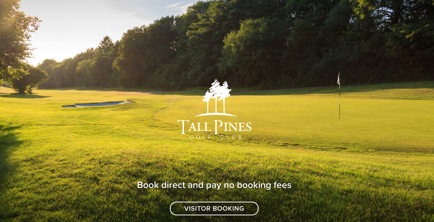
The simple reason for having a tee time landing page is that your homepage is designed with a more general purpose in mind including membership, societies, functions etc. It is likely to be an overview of your whole venue and is typically loaded with links and navigation to other areas of your website. A landing page helps convert paid and organic traffic into profitable direct bookings, and is a great tool to use when marketing tee times at your venue as it can allow you to highlight special offers etc
I cannot stress enough the importance of having a mobile responsive homepage. The average person will experience some serious stress when a mobile loading delay hits, and even more if they have to pinch and pull on a mobile device to book a tee time. Some say it is even more stressful than a shank off the first tee (we’ve all been there, some of us more than once!).
So why is this mobile responsive stuff so important? Well our lives are now always on, everything is on demand and that means we want everything instantly. Hungry and don’t fancy cooking, there’s an app for that. In fact there are multiple apps for that! This leads to the consumer expecting the perfect user experience for what ever they are doing online, and if they don’t get it, golfer or not, this can lead to them not buying what they were looking for i.e. a tee time.
How does this affect a landing page for tee times?
Firstly, the page should be simple, the less the golfer needs to do the better. i.e. a button saying ‘book a tee time’ with an image of your signature golf hole on is perfect. It is worth noting at this point that most of our decisions are based on emotion, so make sure you use great creative images and wording that will make a golfer want to hit the fairways (and in the process purchase a tee time from you).
When designing a landing page for booking tee times make sure you ask yourself what your customers needs are. For me its the thought of hitting it 300 yards down the middle of a striped fairway with the sun on my back, with the promise of a cool beer in the clubhouse. The solution is a picture of a golf course with the sun out and a welcoming 19th hole in the distance.
It is also important to remember that golfers are social creatures, so use some social proof. Use Golfshake or Google reviews. The stats say that nearly 70% of customers who purchase something online will look at a review beforehand… make it easy for them, and choose the reviews the potential customer sees by adding them to your landing page.
Your ‘call to action’ (CTA) is also really important. Book a tee time is great, but perhaps add that the ‘best prices are available direct’ or ‘book a tee time now’ to create some urgency. Also, is the CTA big and vibrant enough? You should never have to search where to book!

